T-Mobile
Overview
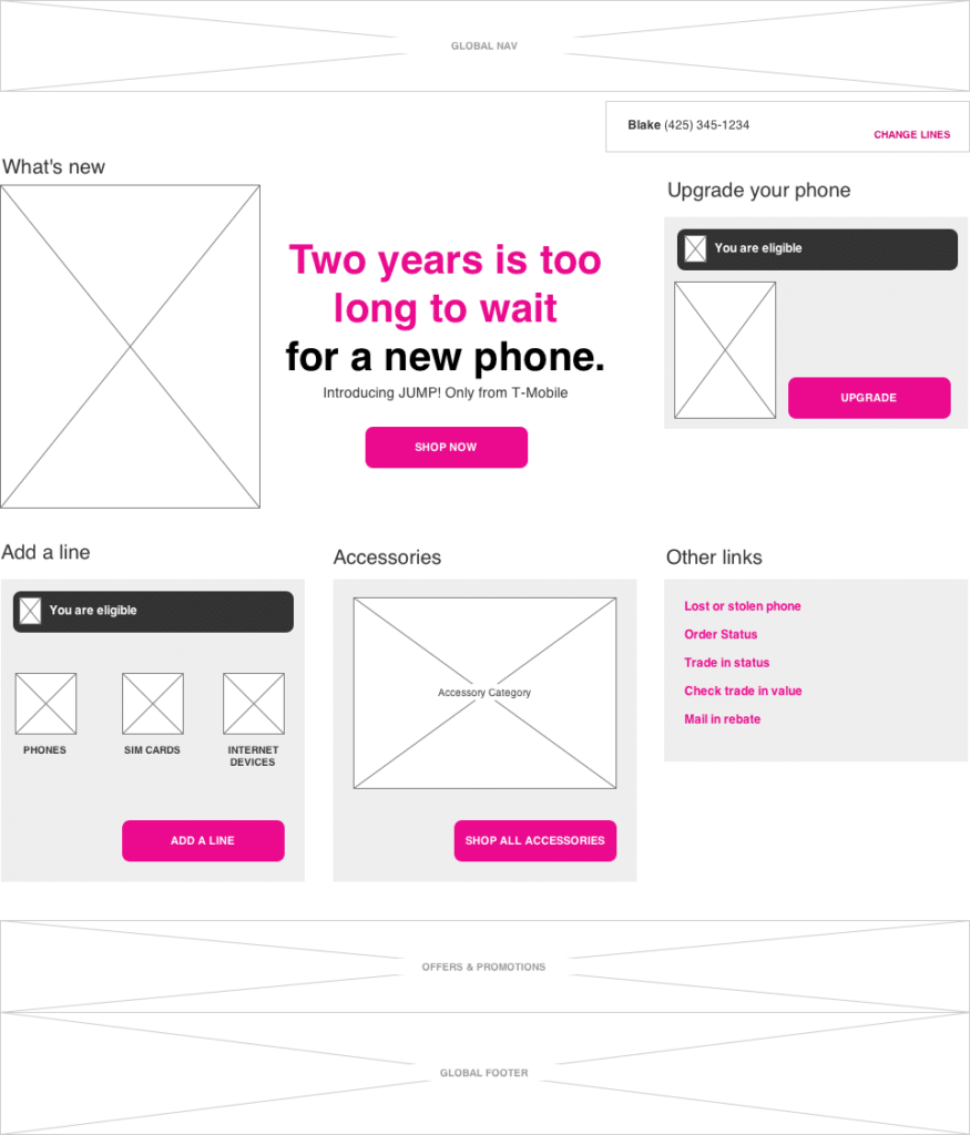
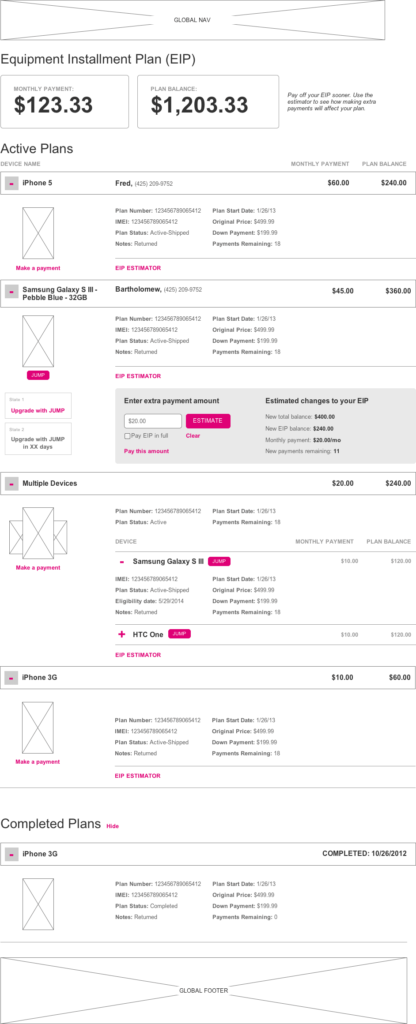
While consulting at the Garrigan Lyman Group in Seattle, I had the pleasure to work with a team of ultra-talented UXAs to restructure both the purchase flow and customer-facing backend of the T-Mobile website.
PROBLEM
The site was outdated and very hard to use. Users were getting lost and confused in checkout and were having difficulty finding the information they needed to make a purchase.
SOLVE
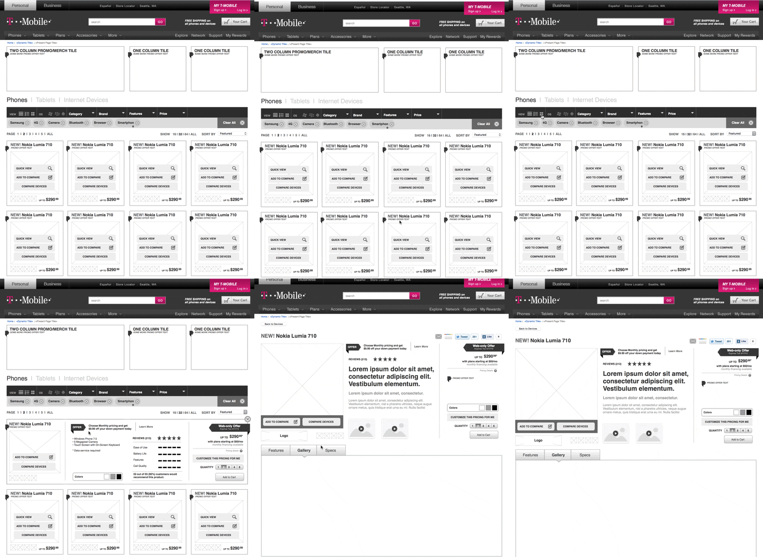
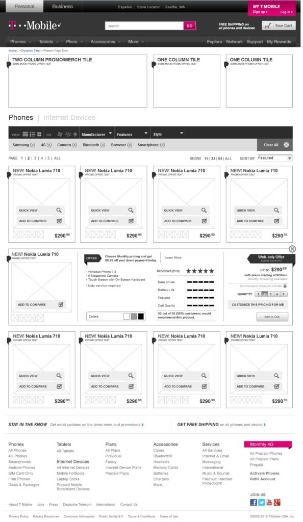
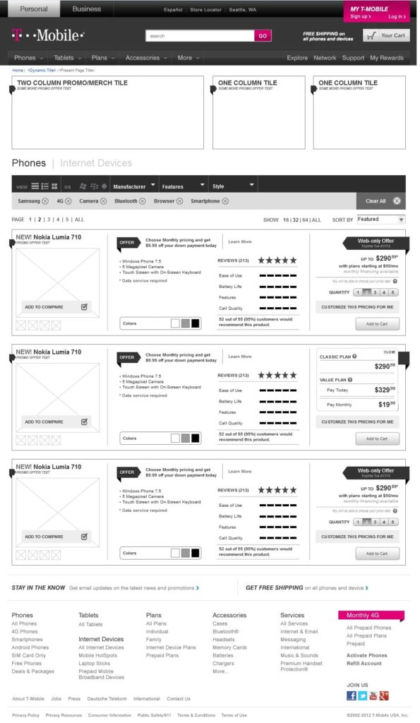
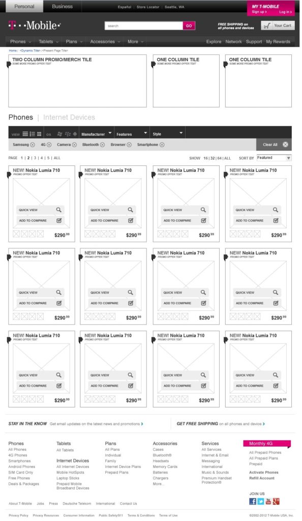
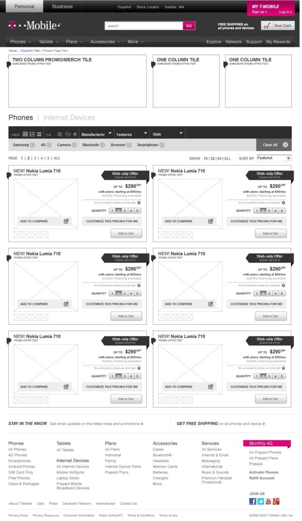
The team conducted customer interviews and tested the hiccups in user journeys. By flipping the purchase path upside-down from ‘choose your plan first,’ the team focused on ‘phone first’. This alone resulted in a huge spike in customer engagement (17%) as well as 33.7% in sales growth.
Matched with a completely new responsive interface and updated online presence, users of T-Mobile were set up for all the success we see them growing with today.
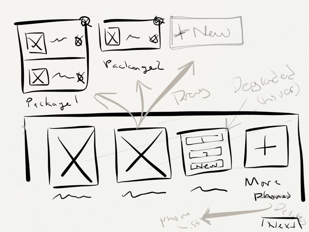
We spent several weeks researching, sketching, brainstorming and testing new flows and user experiences for the site. Through a user informed approach, we ended up flipping the entire customer experience on it’s head. Taking it from a “choose your plan first” approach to a “choose your phone first” approach. Needless to say the recycle bin got quite a workout through this part of the process but in the end we were all very proud of the work we were a part of, what it took to get there and the final result you see today.
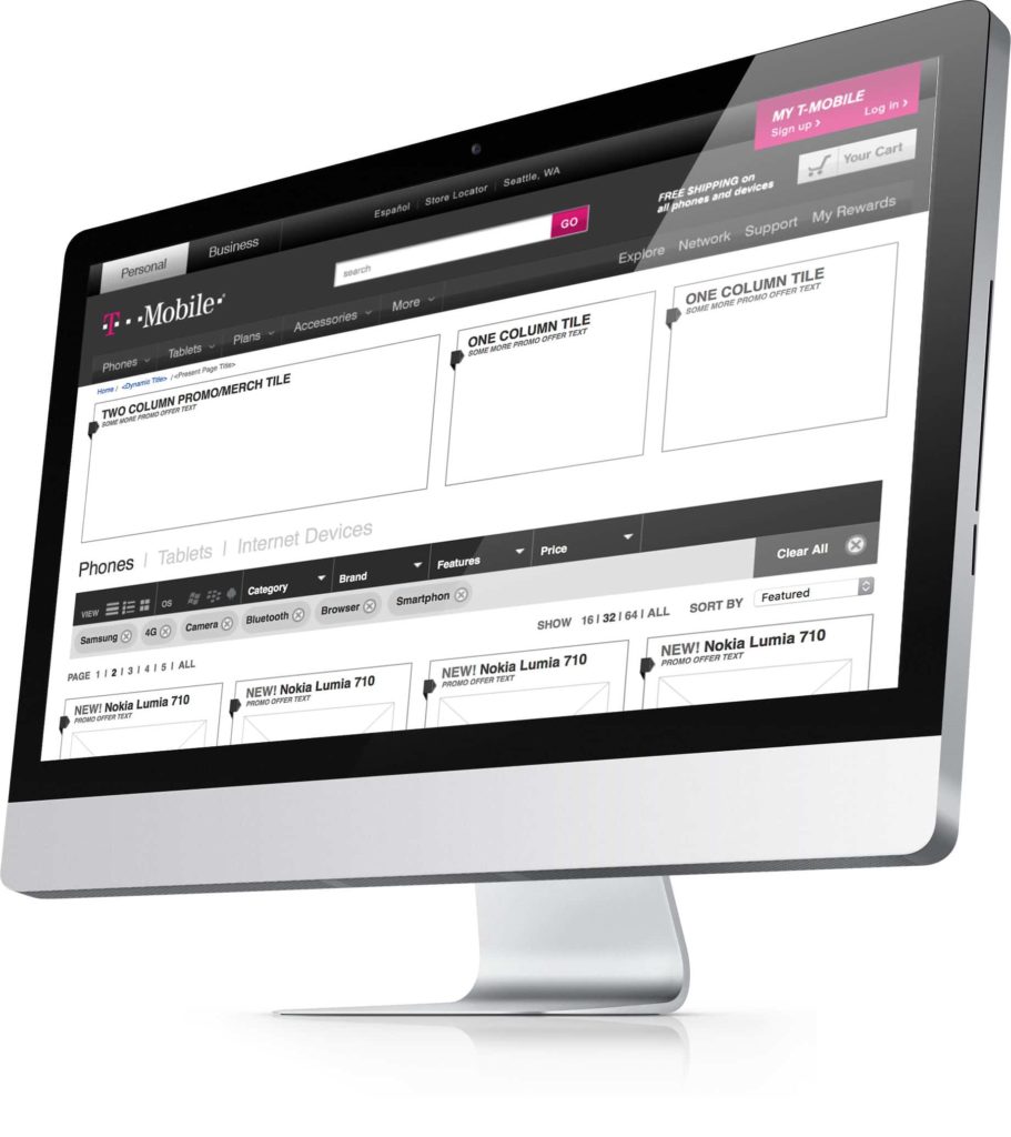
Purchase Path
My.T-Mobile.com
