As a 30+ year old company in the global technology space, Allied Telesis had been doing what they do for a very long time. There hadn’t been much change over the years as the landscape evolved and they were in desperate need of fresh, new eyes and strong backs in the design sense to help them bring their technology power to the new media-savvy customers of today. They needed a strategy and master plan to reshape the way they presented themselves on many digital fronts.
My Impressions
This company is extremely well known globally for its powerful backbone technology. They just needed front-end communication to match. Doing business the same way for over 30 years, Allied was in desperate need of a digital overhaul. This starts with strategy. From there we craft a plan to shift the way things are done one messaging silo at a time.
Where it started
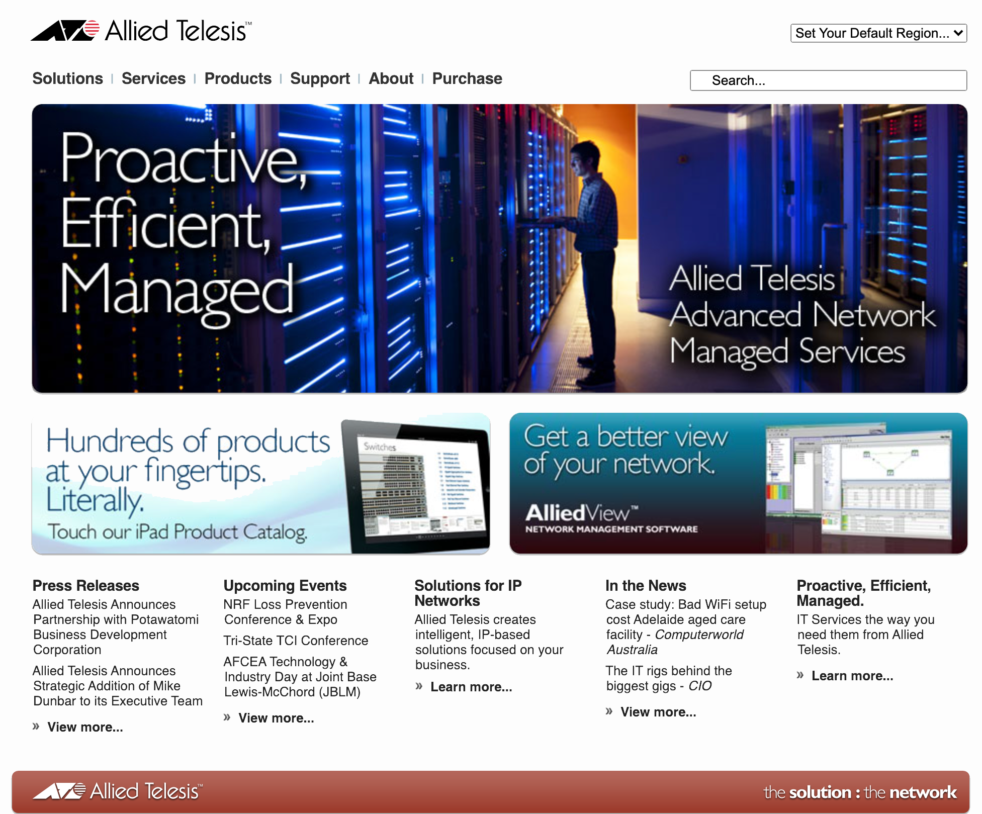
"It's just a digital catalog"
Since the website’s initial domain registration in 2001 and site creation in 2008, the Allied Telesis website was essentially a replication of their printed product catalog. It was perceived and used as nothing more than a digital representation of whatever the company had available in print with a little bit of news and information about events and training thrown in. There was little to no plan for how it would function as a living, breathing sales tool. By 2016, the website had gone through a few backend upgrades but hadn’t made any real advances into embracing modern web practices or marketing strategies let alone provide any greater use for sales of their products and services. That desperately needed to change.
Discovery
Usage Research
Upon my initial dive into the usage patterns of the users, I found that despite having pretty good traffic, the majority of the users came in from Google searches looking for product datasheets and skipping past any marketing or informational pages the site had to offer at all. This wasn’t entirely surprising but it did frame the uphill work ahead in how to not only begin to acquire new types of traffic but to also entice the existing traffic to explore deeper into the site.
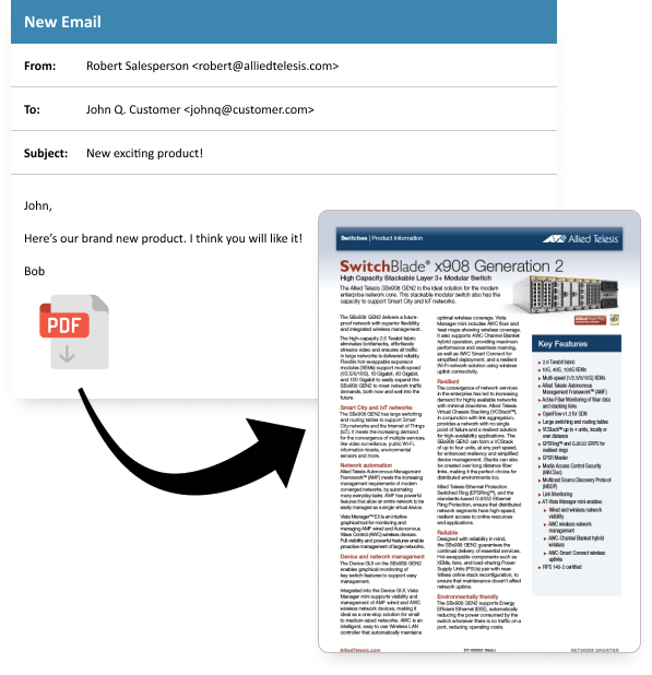
Additionally, I found out that by in large, the employees and sales staff of Allied didn’t really even use the site for just about anything. All communication with customers was through email and in sending copy-intensive PDF documents of (essentially) snippets of the printed product catalog.
Content Strategy
Story-driven design
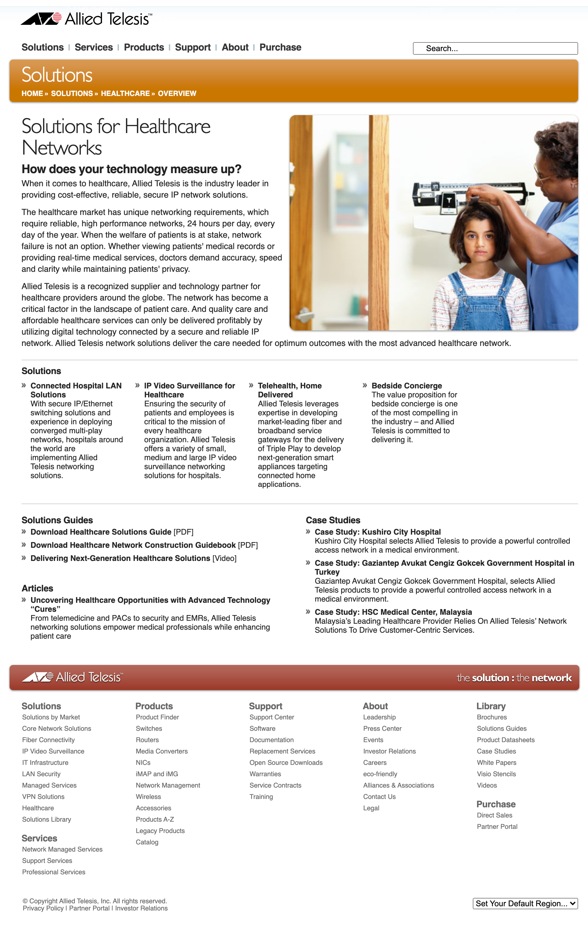
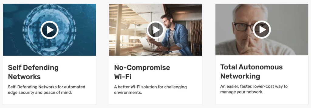
The company was 30 years old and had numerous successes all over the globe. These stories were interesting and needed to be told. I began by using this idea as a foundation to how to stitch the whole new site architecture together. By creating a mesh of interweaving stories throughout the site, the user would be led through a discovery experience that provided an opportunity for a deeper understanding into new and exciting offers available to them that they may not have heard of previously.
The decision was made to utilize the collection of success stories and press releases that the company had amassed over the years and expand on them. Split them up, where we could, into bite-sized snippets of engaging content that would be peppered and linked all throughout the site. We also decided to add a blog to the site to house thought leadership on various relevant topics. This plan would take some time and considerable effort to put into place so the content team began working on it right away to be ready for the initial launch of the new site.
User Experience
Taxonomy and tagging
To organize content as well as create similarity threads throughout the site, we developed a taxonomy of terms and a tagging system for all content. As a user follows the breadcrumbs through the site, they are attached tags that then reflect their interests. Once we understand the browsing habits and interests of a particular user, we are then able to show additional content relevant to their browsing habits.
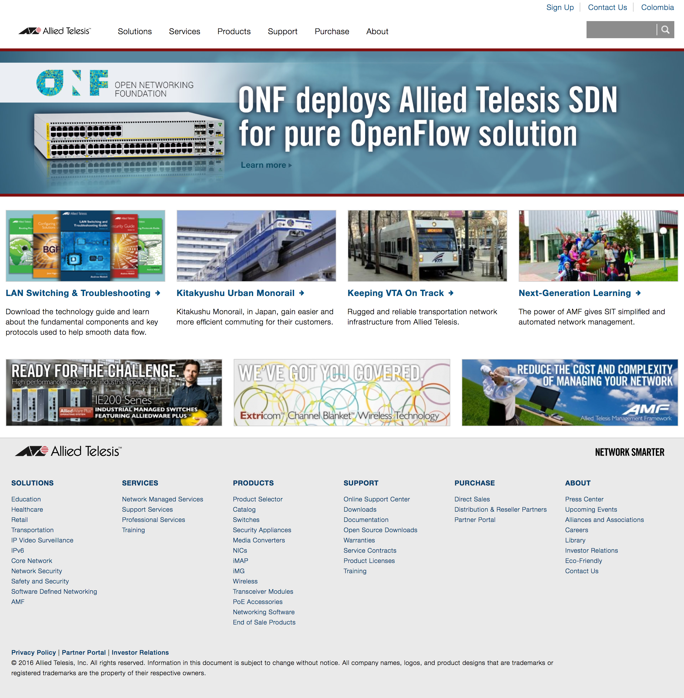
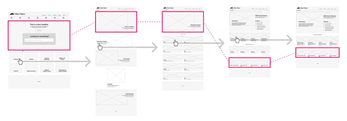
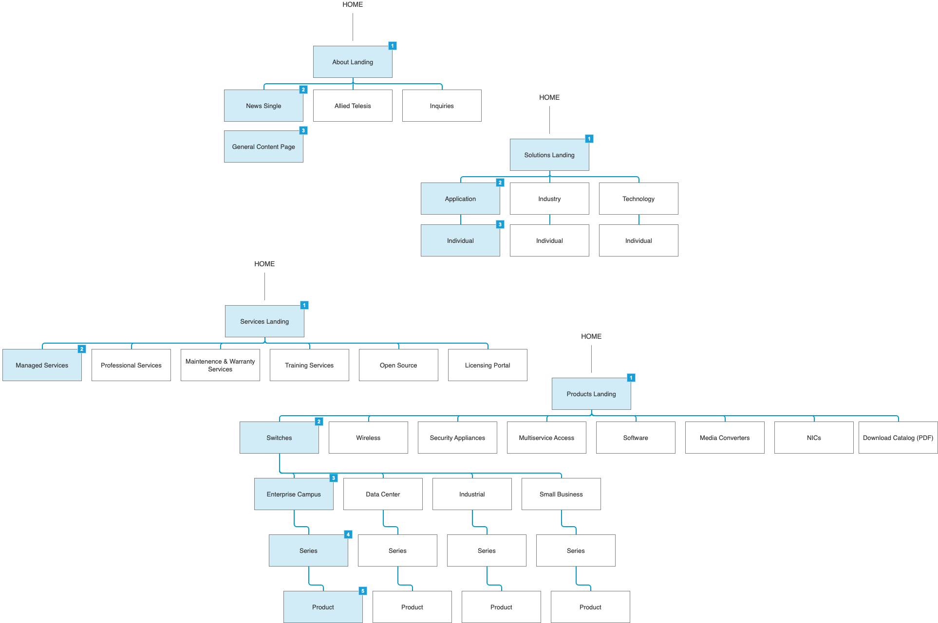
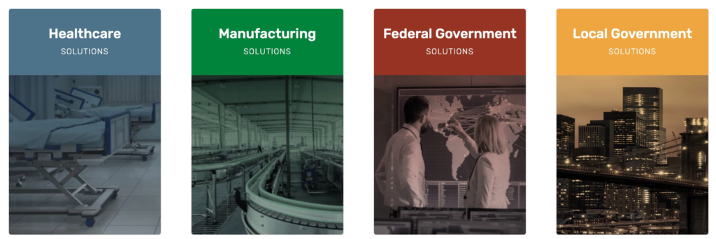
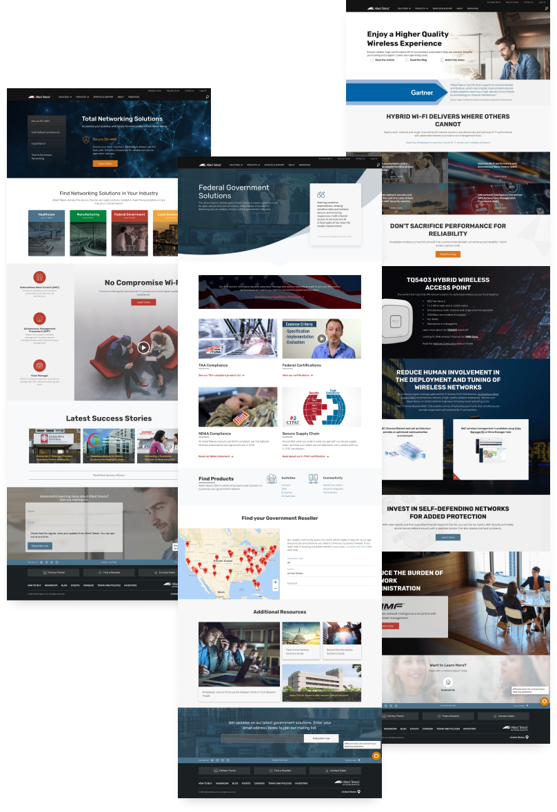
Landing pages and SEO
As part of the sitemap, we added landing pages for many verticals throughout the site. These pages would allow us a place to collect stories and create entrances to filtered content much easier. We then incorporated a robust SEO strategy for page-level headings and links.
Hundreds of wireframes at every one of 5 responsive breakpoints were created and tested until we had a solid structure to build out content. This structure resulted in a solid map for a content matrix, so we got to work!
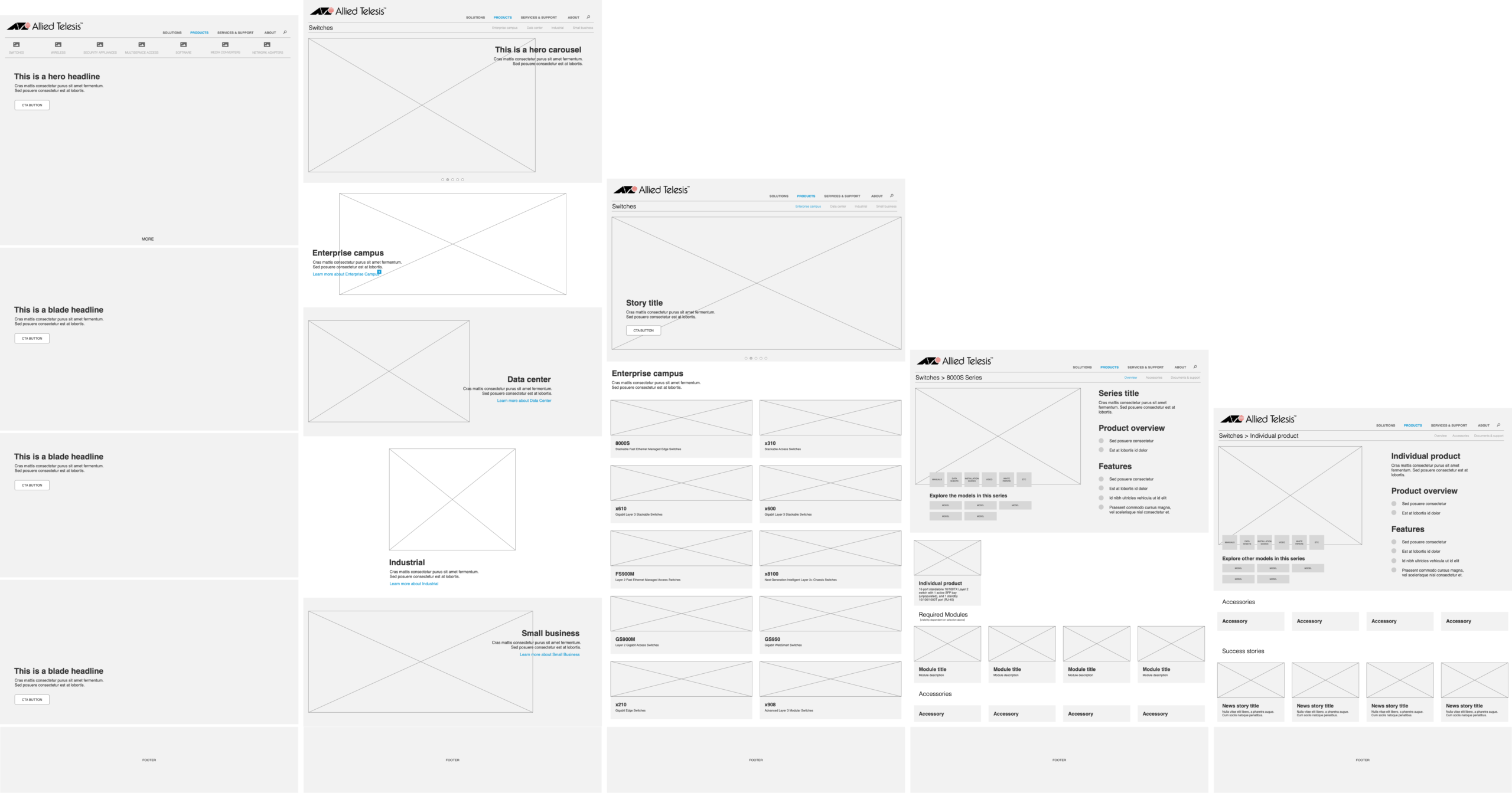
Wireframes
Component Design
Atomic design
In the latest version of the website, we utilized an “Atomic Design” methodology and developed many customizable components that can be used in page layouts and keep consistency across each use on every page. This upgrade was a huge undertaking and is proving to be extremely successful and sustainable. I look forward to seeing this upgrade evolve over time.
User Interface
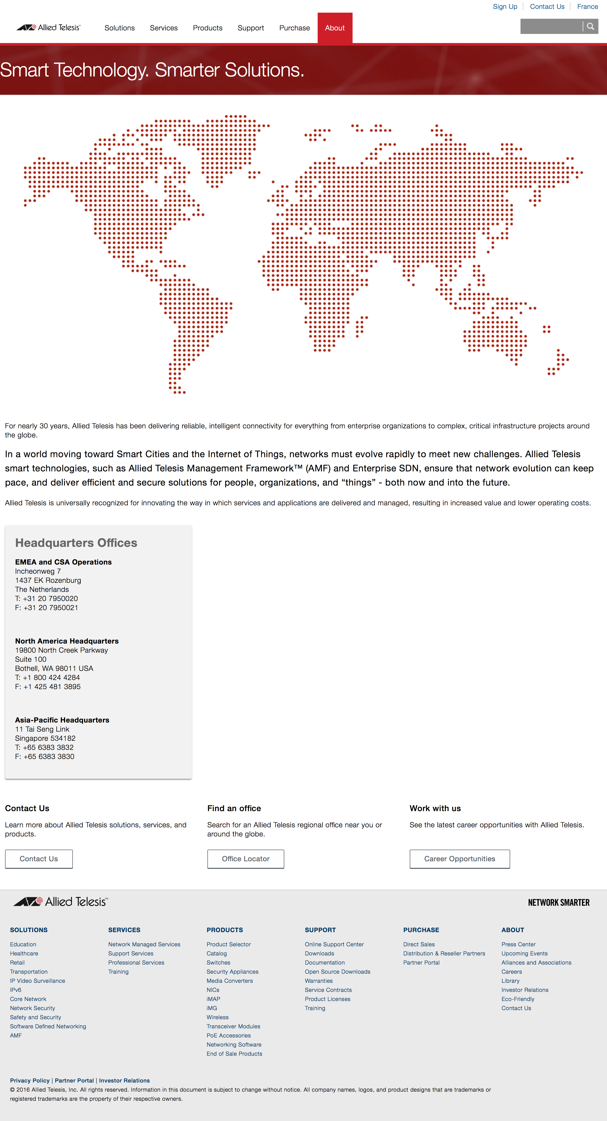
Page layout "like a sandwich"
Every page of the Allied Telesis website is composed of what we called a “hero” or top headline section of the page and a stack of “blades” below that. This layout strategy allowed for ultimate flexibility and customizability within each page section.