Brent Spore

Overview

I was contacted by OnlifeHealth to consult them as part of an effort to examine & reevaluate their online presence in it’s entirety. The initial request was to review and research their application and then make recommendations for a new user experience and interface across the board. They hadn’t updated their application’s UX or UI in quite some time and knew it needed a refresh. What began as a research and exploration project, turned into a complete overhaul resulting in a fresh, tested, clean & responsive design that both they and their users were proud of.

My Impressions

OnlifeHealth had a very outdated application in it’s appearance . Of their parent company’s tens of thousands of customers, the adoption rate for their service was extremely low. Their online application was powerful and robust but the experience and interface were in need of a helping hand.

User Experience

Research

We spent a considerable amount of time learning about the existing patterns of the system’s users. Their most frequented pages, common questions & general usage statistics. Then, addressed the layout of the overall site based on what we knew about the demographics and audience. We discovered that many users were getting lost in certain sections, visual hierarchy was an issue and some navigation elements were hard to understand. Additionally we developed several persona styles and focused designs around those types of individuals and what their desired outcomes would be.

Wireframes & Prototyping

“Start from scratch, hold on to only what the data supports as valuable, re-imagine ways we can connect with our audience, re-think everything top to bottom and don’t let anything hold you back.”
Once I had a clear understanding of the capabilities and backend data and technology of the application, I focused on coming up with a page structure that adhered to the directives we established in the initial research phase while envisioning some new data visualization possibilities and placement to better convey what was most important on each page while allowing the system to gently guide the user through the various processes it contained.

User Interface

Responsive Design

Native Apps

AlwaysOn

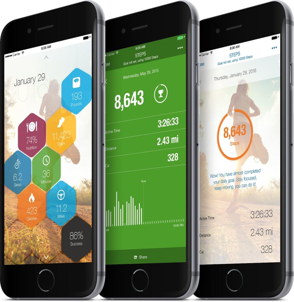
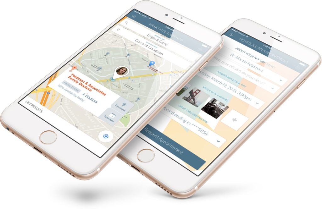
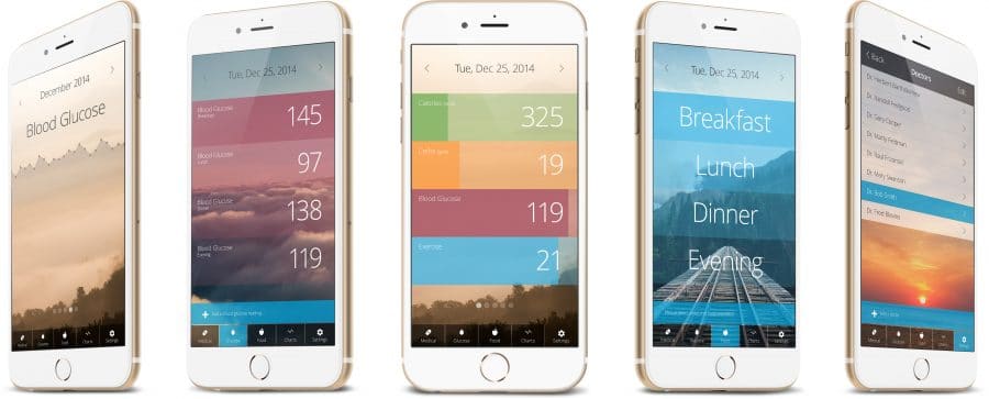
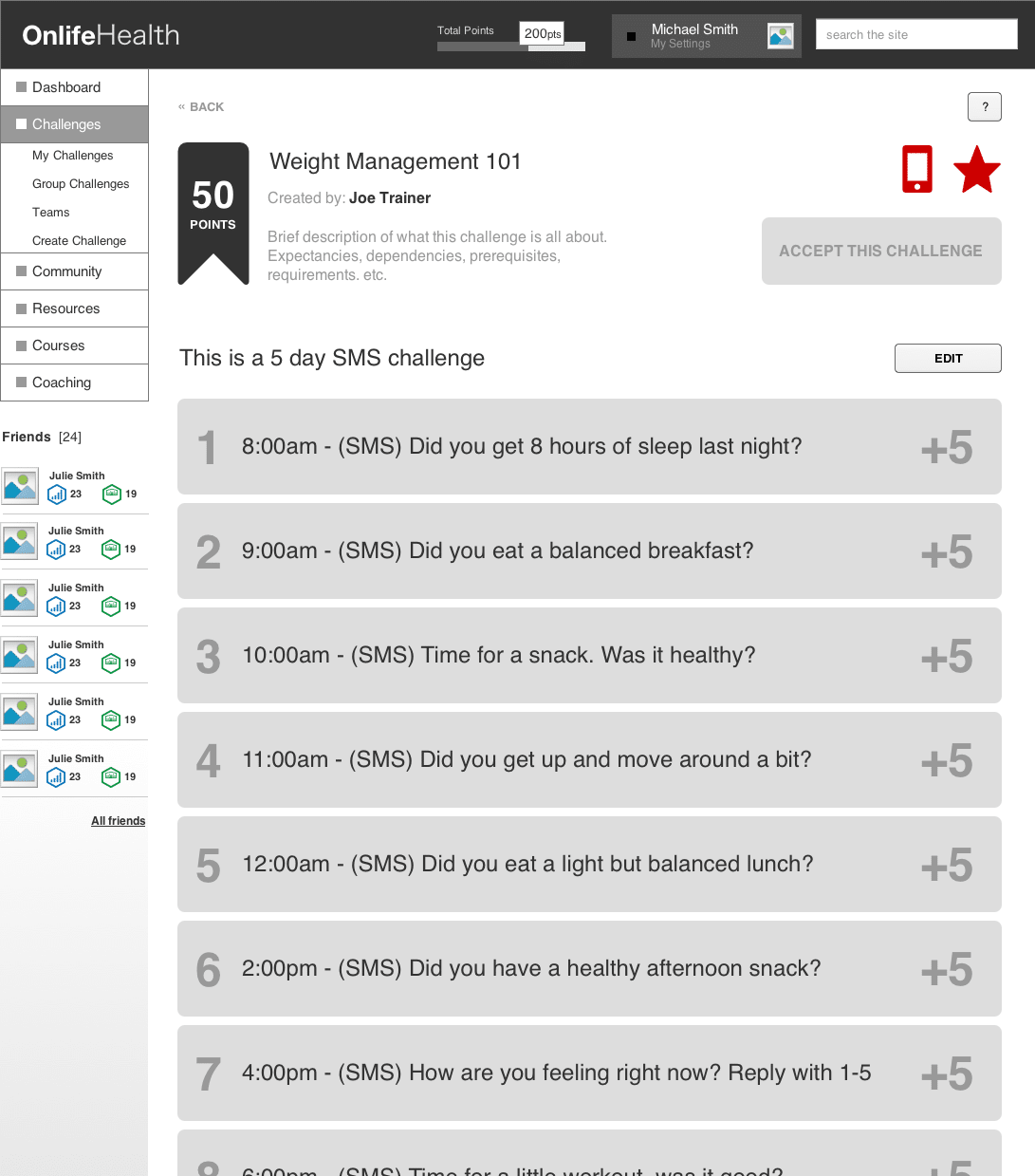
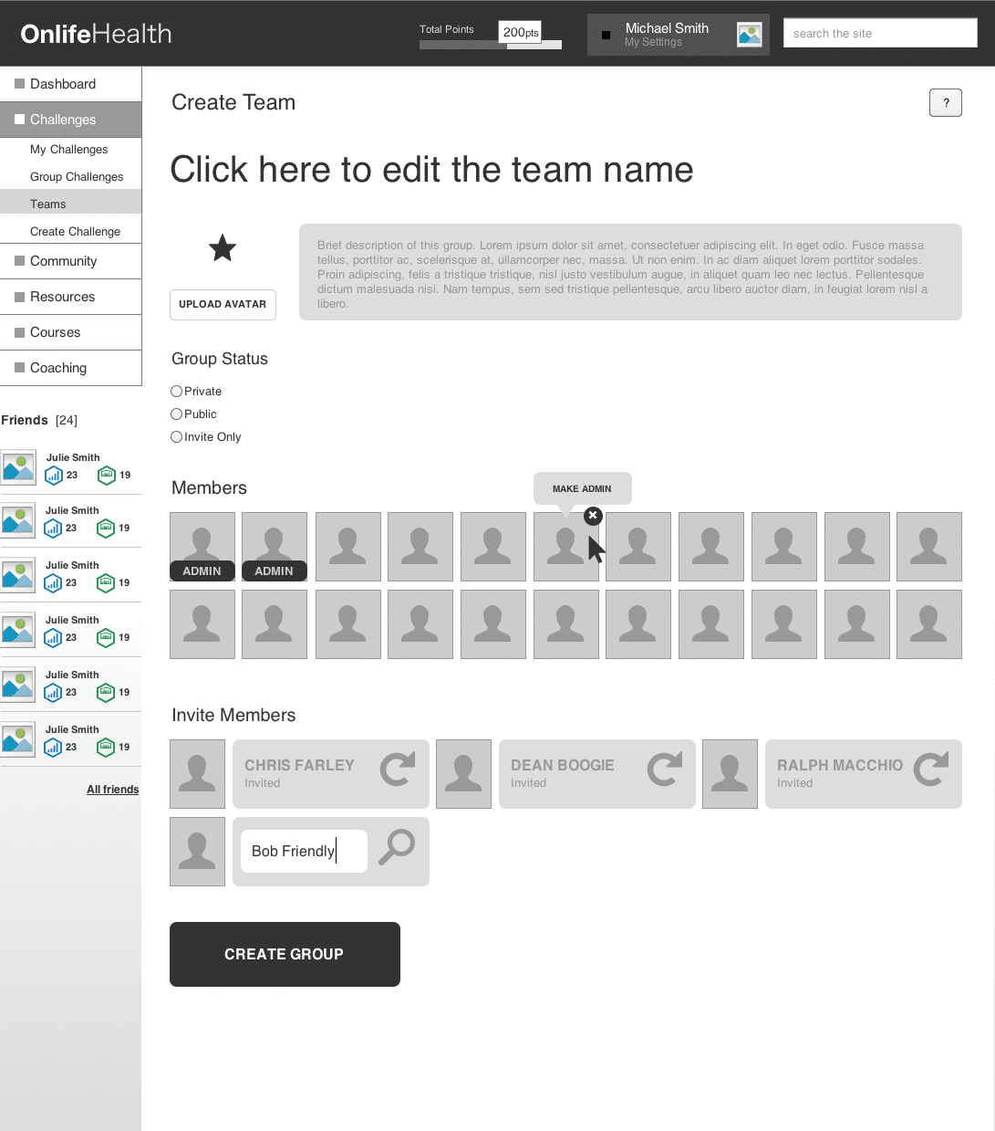
Taking such a robust application and making it simple and fun to use on a small device was quite a challenge. Where we had nearly all of the functions available to users in the responsive versions of the desktop app, we wanted to make the native app experience extremely deliberate and powerful. After re-imagining a lot of functions and structuring them inside a compact interface, we went even further and built in many unique features that were only capable with a smartphone or watch. Step tracking, heart rate monitors, distance tracking, location notifications and challenges were just a few.

Find a Provider

Find a Provider is a simple app to help users find a health provider in their network within a given geographic radius. Once a provider is found, a user can schedule an appointment. The app will remind them of their appointments, give them directions to the location and provide simple communication methods for them to get timely feedback from their provider’s office.

Diabetes Tracker

Designed to help diabetics keep track of their blood glucose levels, manage their sugar intake and learn about doctors & food. The app was designed to be simple and very powerful. Featuring databases of nutrition information, doctors & health providers as well and easy to use tracking tools for keeping track of intake as well as medication.

Icon Design

Onlife Icons

To add clarity & visual identity to all of the different products, services and sections of the Onlife application, I put together an icon library. The goal was for the icons to be simple, clean and easy to identify. We tested may versions internally as well as with with focus groups and at the time of publishing this case study, this is the most current version of the icon set.

Let's Chat!

I’d love to hear from you. How can I help?